This was my article on Chinese Calligraphy that was published in the September 2006 issue of 'The Taichung Voice'.
Calligraphy
When asked to write an article about Chinese Calligraphy I was first excited and then daunted. Explaining in a mere 2000 words an art as elegant as Chinese Calligraphy, seemed near impossible. And one of my friends was dubious that I could create appreciation for Chinese calligraphy in the alcohol swilling foreigner crowd.
The simplified definition of Calligraphy is ‘language written by hand’. Where once the western languages were written by a precious few trained in writing (think monks in monasteries slaving tirelessly over manuscripts) now, except for a few unfortunates, most everyone is able to write by hand. The art of Calligraphy in the West is almost extinct but is alive and well in China. Why has calligraphy died in the west but survived here? For the Chinese the writing of Chinese characters it is not simply to convey a thought but visually express the beauty of the thought and the writer’s sentiment. This is why Chinese Calligraphy is classed as an art. In the China of old, there was such respect for the written word, that no piece of writing was ever torn up. There were even designated pagodas where people burned used paper with writing on it.

Calligraphy was thought of differently in the west. It was meant to be beautiful, but the height of ‘manuscript illumination’ (production of books by hand) was really the beginning of the art of illustration, as letters were merged with images, symbols or colors. One reason for the decline of calligraphy in the Western world, was that the majority of the languages were based on the Latin alphabet, which while easy to use is extremely simplified because it was developed for carving in stone. 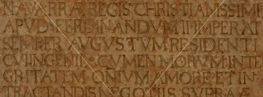
Languages, that use the Latin letters, don’t have as much variety as the Chinese characters. The Latin letters use uniform line weights and are either curves or straight lines and in all but two of our letters, ‘j’ and ‘i’, the letter strokes are connected. In Chinese Calligraphy there is more variety in their characters, they use 40 or more different types of strokes and dots. Each stroke has varying line weights, angles and finales (serifs).
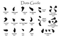
The dots – the dot in Chinese Calligraphy has numerous shapes, they are written instantaneously and require superb dexterity and control. These examples are the most common types of dots.

The strokes – a single well executed stroke is praised because it is a sign of good brushwork. Attaining the correct gradation in line weights, clean lines, the correct start and finish to the lines and the proportions are all very difficult to do in the second it takes to make the stroke. With so much to be aware of, years are spent practicing them until they become second nature.
With all these things to keep in your head as you write there is of course another level to consider when writing the characters. The strokes themselves must have a certain look or quality to them. The qualities of the strokes are labeled; ‘bone’, ‘flesh’, ‘muscle’ or ‘blood’. Writing that has a certain strength or power from passion is labeled ‘bony’ while calmer, slower writing is ‘fleshy’. The ‘flesh’ of the stroke, depends on the thickness of the brush hair, the amount of pressure and amount of water in the ink. Writing that has lots of bone and little ‘flesh’ is called ‘sinewy’ while writing with more flesh than bone is called ‘piggy’ and looks thick and bloated. Powerful ‘sinewy’ writing is divine and highly praised where as writing with neither sinew nor power is considered weak. All writing should show the power and strength or ‘bone’ of the writer. In well written characters, if it appears that the strokes are strongly connected to each other, like ligaments holding together bones, the writing is said to have ‘muscle’. And finally the ‘blood’ of the character is the quality of ink and its color.
Creating the Strokes
If that was not enough for you, you must also consider the composition of the strokes in the character; the aesthetics of balance and proportion. Just as two artists will not render the same picture from the same scene,  two calligraphers will not write the same piece of calligraphy with the same characters. Although stroke changes have been made to characters and given rise to different ‘styles of calligraphy’, one of the biggest contributing
  factors to the creation of different ‘styles’ stems from the artist’s choice of balance and proportion. A calligrapher must correctly balance the different components of the character.
  To begin, the calligrapher must consider the ‘skeleton’ of the character. This is the balance of the parts in relation to each other and the white space in between. Often the characters are written with the guidelines of a 9-fold square, which helps integrate the parts making it more balanced and utilizes the white space needed to let the character ‘breathe’ and exist in the space.
Composing the Characters
Some characters are created from 2, 3 or 4 other characters, the problem of balancing these characters and arranging them has to be solved differently for eac h character. One of the concerns of Chinese Calligraphy is that it shouldn’t look uniform and manufactured, but more natural in appearance, ‘Chinese Characters should look like a mass of spring flowers or like fallen leaves, without artifice or confusion’. If there is repetition of the same strokes in the character they may shorten or lengthen the strokes to make each different and yet still have the same character. Some characters are of uneven
  density yet others have too many similar strokes. Then the calligrapher must avoid over-density in the one area and work to balance the ‘looser’ part. For characters with similar strokes, care must be taken to avoid monotonous repetition and accentuate asymmetry. They will frequently lengthen or shorten strokes to enhance the appearance of each character. Characters that are pierced, lean, face to or away from other characters are difficult to balance and are frequently adjusted to attain the most pleasing composition. The important thing to remember is that they are meant to be balanced but not uniform, varied but not chaotic, have stance and proportion and sit well in the space they are meant to occupy.

The Styles
As alluded to above the rise of different styles, stemmed from different spacing, proportion and line weights. The first style, the T sang Chieh ( ), was used centuries ago to write on shell and bone and can be seen still on display at the National Palace Museum in Taipei in their permanent ‘Oracle Bone’ exhibit.
The next style was the Ku Wen ( ) and was used for inscriptions on bronze objects, it is also on display at the National Palace Museum. During this time there was no standardization for either of these styles. Standardization came later when a famous recorder to Emperor Hsuan created the first standard script called Ta Chuan, or ‘Great  Seal’ it was widely adopted and used until another script was created to unite the different styles of the feudal states. The new unified script was named Hsiao Chuan or ‘Small Seal’. It was modified from Great Seal but more suitable for use by all the states. From ‘Small Seal’ script they dropped the irregularities and made each character occupy the ‘imagined box space’, still to this day children learning to write use the square box as their guide. But they hadn’t begun to use varying ‘line weights’ (variances in line widths – a line that goes from thick to thin). The lines in the characters were the same width. The creation of the ‘Seal’ scripts or Chuan Shu weren’t specifically for seals but they are still used in engraving seals to this day.
After ‘Seal’ script, a man named Cheng Miao invented a new script, Li Shu. The new script offended the first Emperor of the Chin Dynasty and Cheng Miao was imprisoned, where he thought about his new style for 10 years. In that time he came up with three thousand characters. After he was freed he attained a high position in the government and used his style for official purposes. It was much easier to produce than Seal script which the clerks found slow and laborious so it was used as a type of short hand. In Chinese ‘Li’ ( ) means clerk, so in time this Style of writing was dubbed, ‘Clerical Script’.  After a while, this became the desired script and most official and ceremonial objects were written with this style of script. It is in this style that the variation of strokes and line weights was created in part due to the great strides made in writing implements and in part because its primary use was on paper not stone or metal. This is also when Chinese left the roundedness of the character’s appearance for the boxy, angular look we are more familiar with. This style is still studied by calligraphy students, once you become proficient in calligraphy, you can attempt to learn this style. On one of my many trips to the National Palace Museum I saw a fantastic display of calligraphy in which I could see beautiful examples of all these styles, unfortunately it might not be one of the permanent displays.

The next style to arise was the Tsao Shu ( )or Chang Tsao ( ) in English called the ‘Grass’ Style. Chang ( ) means ‘essay’ or ‘chapter’ and Tsao ( ) means ‘grass’ but when used as an adjective means ‘rough’. Scholars believe this style first arose as something written quickly as a rough draft, but later was developed because of the beauty found in its flowing strokes. The longer this style was practiced the more carefree and loose it became, and the beauty found in the flow of the characters was prized over the adherence to stroke order, size and proportion.
 Kai Shu or ‘Standard’ style is a combination of Li Shu’s angular precision and Chang Tsao’s simplicity and speed. Developed at the end of the Han Dynasty or the beginning of the Tang Dynasty, the strokes took on the qualities of ‘bone’, ‘flesh’, ‘muscle’ and ‘blood’. Kai Shu is the most common style used in Chinese Calligraphy, most calligraphy students begin learning calligraphy with this style. It is also the style most frequently seen, on a daily basis as the typographic element in signage and design.
 Hsin Shu or ‘Running Style’ was invented by Liu Te Sheng in the later Han period. This style was created before Kai Shu was firmly established as the ‘Standard’ script, so they developed at the same time as parallel styles. The characters are not angular like the Kai Shu, because Hsin Shu was created to accentuate the ease and movement of writing characters, thus this style looks looser and freer. It is recognized as the most artistic of the styles and although calligraphy students begin their education with Kai Shu the best calligraphers more frequently use Hsing Shu over Kai Shu. Although it looks looser and freer, the strokes are designed and are meant to be executed as precisely as Kai Shu, the only difference between the two is speed. By using so much concentration to have the correct strokes, proportion and flow, writing Hsin Shu becomes an all consuming task. Although Kai Shu is written slower and Hsing Shu more rapidly, both can be used as a form of meditation because when you try to write either, time will cease to matter.
When looking at the numerous examples of Chinese Calligraphy remember how much goes into producing these pieces of work, years of training and practice. Look at the quality of strokes, what do they lend to the meaning of the character. Think of the different styles and how they give structure to the thoughts of the writer. Are they measured and precise or loose and free flowing? Does each character  occupy the space with the same weight and mastery as the other characters or are some more dominate? Chinese calligraphy is an art. Now that you are equipped with some of the knowledge of its development and the care with which it is executed have fun looking and appreciating this exquisite art. To purchase calligraphy you can go to either of the Jade Markets in Taichung, the weekend market at the intersection of ‘Wen Shin’ road and Taichung Kang road or the Saturday morning/afternoon Jade market off San Min Road across from Taichung Park. Remember you either need to be literate in Chinese or take someone that is, to explain the meaning of the calligraphy to you. If however this has inspired you to learn this amazing art, there are calligraphers dotted around the city that teach students. My teacher is at the top of Art Street on the right side of the road, and like most calligraphers he speaks almost no English, so you either exercise your Chinese or learn almost exclusively by sight. What ever you chose to do, I hope that the next time you see Chinese calligraphy you can appreciate it.
 On Monday, October 30th Julie and I went to meet Kellie at her new apartment just off Denman in Vancouver. It's a nice apartment with a goreous view of English Bay. I was finally able to meet Micheal, her boyfriend. He's sweet but we didn't spend much time there with him, instead we walked down Denman to a breakfast place, ate and then went into Stanley Park.
 It was gorgeous weather and everything looked beautiful. We even saw a good selection of wildlife. Kellie told us all about the difficulties of adjusting to life in
  Vancouver and also the fun and enjoyment of our Canadian outdoors. There were a few swans on water, they were very tame and came right up to us. There were many herons on the water, we managed to see two or three of them. I have always loved big wading
  birds - Herons and Egrets.
 We even watched a raccoon emerge from the bushes to go down and rustle up some dinner. There was a nice and informative sign telling us to beware of 'rabies'. So we gave the lovely raccoon a wide berth and continued out walk.


 Then we went to my favorite art store in Vancouver, Opus. It was awesome going with Kellie and talking about art and different things. I was looking into how to get different size canvases from there to Taiwan. I did buy a few new things to try. I'll let you know if I like them. Notice the sizes of the canvases. Sadly, you can't get canvases in those sizes in Taiwan.


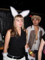
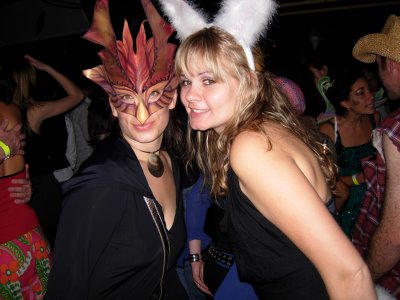 Knowing that there would be Hallowe'en fun in Vancouver when I arrived I took my Roman Mask and Karishma dress to blend in with the other Hallow-weiners. I even had one girl comment on my mask and then inquire as to what I looked like underneath ???? The music was pumping and Julie and I grooved till our feet could take no more ... then we left for home. On the way home we stopped by the movie set of 'Alien vs Predator 2', a sure-fire Hollywood hit starring 'no one that you know'. In our curiousity to see who was in this future blockbuster we inadvertantly wandered onto the set and were asked to please move out of the shot as the camera was pointed directly at us. OOoooops. We wandered around trying to find a better vantage point to no avail, so we gave up and went home where we all crashed hard.


 two calligraphers will not write the same piece of calligraphy with the same characters. Although stroke changes have been made to characters and given rise to different ‘styles of calligraphy’, one of the biggest contributing


 After a while, this became the desired script and most official and ceremonial objects were written with this style of script. It is in this style that the variation of strokes and line weights was created in part due to the great strides made in writing implements and in part because its primary use was on paper not stone or metal. This is also when Chinese left the roundedness of the character’s appearance for the boxy, angular look we are more familiar with. This style is still studied by calligraphy students, once you become proficient in calligraphy, you can attempt to learn this style. On one of my many trips to the National Palace Museum I saw a fantastic display of calligraphy in which I could see beautiful examples of all these styles, unfortunately it might not be one of the permanent displays.
 Kai Shu or ‘Standard’ style is a combination of Li Shu’s angular precision and Chang Tsao’s simplicity and speed. Developed at the end of the Han Dynasty or the beginning of the Tang Dynasty, the strokes took on the qualities of ‘bone’, ‘flesh’, ‘muscle’ and ‘blood’. Kai Shu is the most common style used in Chinese Calligraphy, most calligraphy students begin learning calligraphy with this style. It is also the style most frequently seen, on a daily basis as the typographic element in signage and design.

